User empathy is underrated

In my last post about service alerts I ended up talking about accessibility in transit and the limitations that inoperable assets like elevators can pose on your riders. Wheelchairs and strollers alike have difficulty making it through transit even with amenities that are meant for them. Having elevators that do not work at stops might as well not exist for wheelchair riders. We should strive to make sure that creating service for them and putting them in situations that is accessible is top of mind.
This is called User Empathy
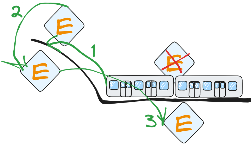
In this photo we can see that the station that the train is stopped at has an elevator on one side that works and one that doesn't. In order for someone in wheelchair to access this station using the subway the person would need to follow the outlined chain of events.
- First they would have to go to the next station
- Then use the elevator to get to the surface and transfer to the station across the street going in the opposite direction.
- Finally they would need to go down the elevator, pay for another ride and then wait for the next train to take them to the destination station on the side with an operational elevator.

While walking up stairs seems like a mundane task for most of us this kind of setback is hugely impactful in the day of someone who needs assistance. Keeping this in mind when designing products and services is an extra task that I often think about when developing TransitChat.
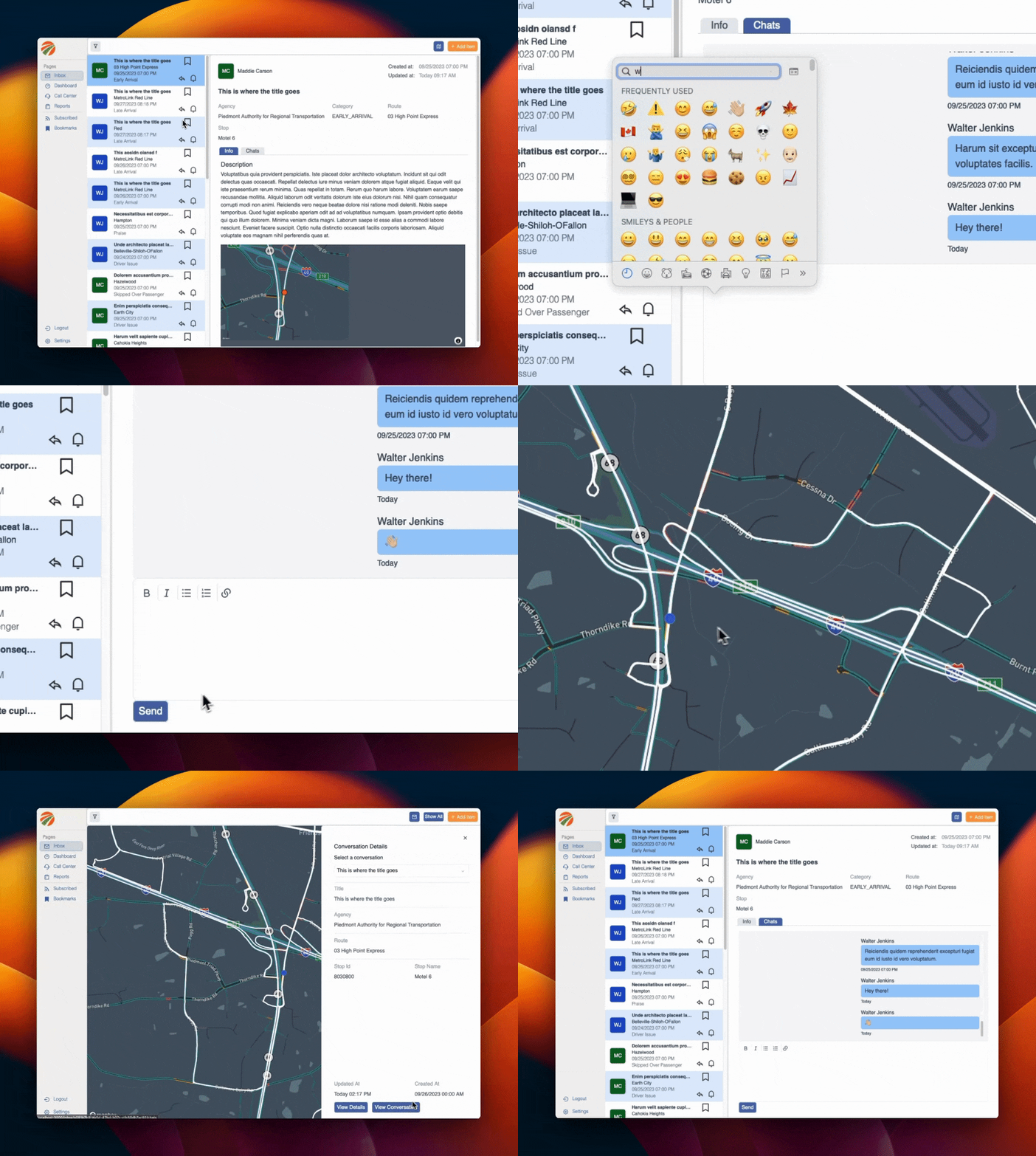
While using TransitChat does not require the use of your legs. There is a learning curve even to the "best" designed software. But when I first set out designing the product the goal was to build something that your average call center employee would be able to use. Having worked with call center employees and dispatchers on how to use products I know just how difficult it can be. Sometimes even very smart people just are not good with technology and I have seen it first hand.
Empathy as a Feature
Its easy to get carried away with all of the things that we could do to "improve" the user experience, ie complicate the workflow. Its easy to get carried away with what looks cool and lose track of what just works.
Which is why we have started small and have big ideas for the future. One we hope our users will help us build.


Member discussion